Generational Wealth Plan
How Generational Wealth Plan Secured Over $250,000 in New Client Fees in Four Months





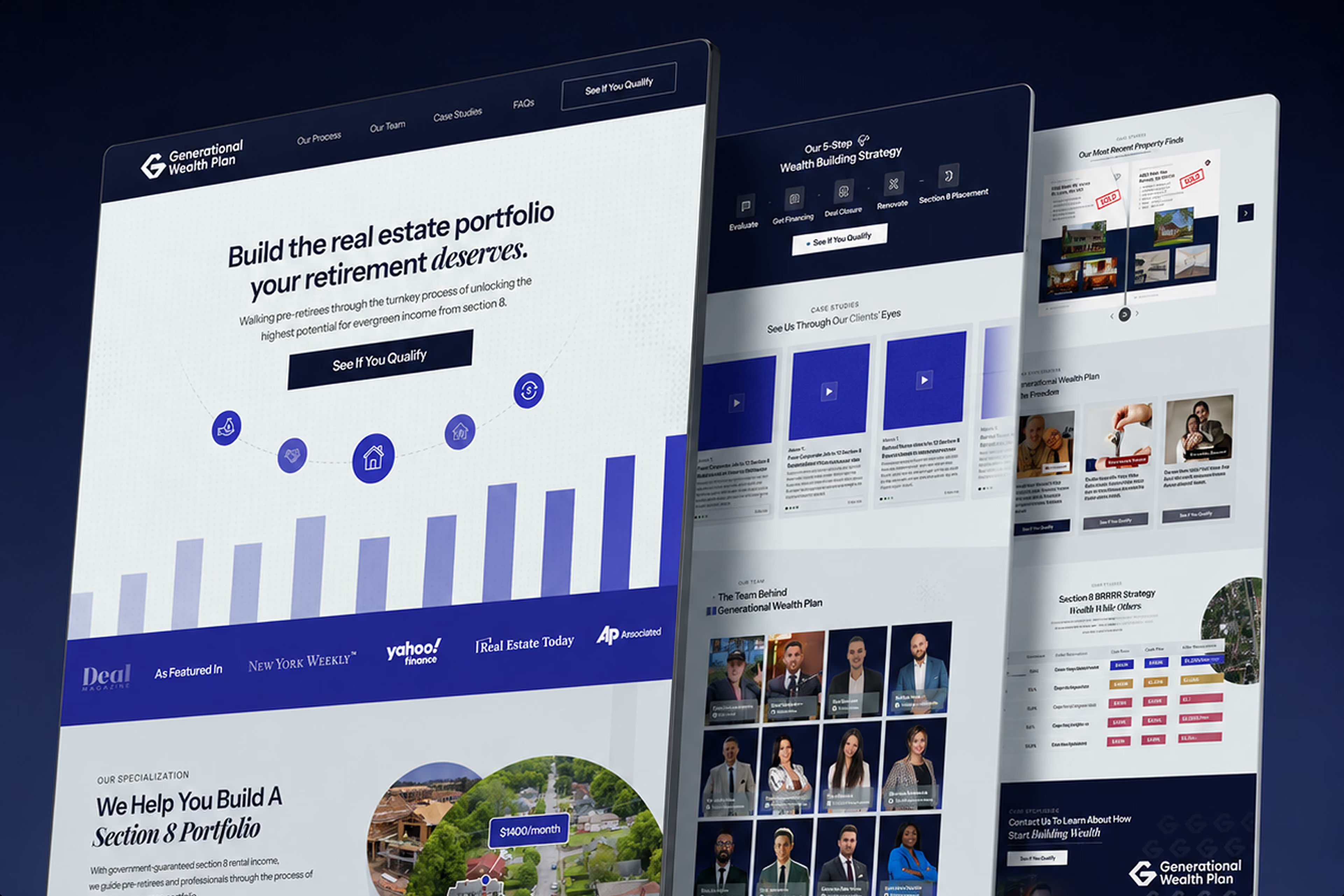
A redesign built to answer the one question every prospect was silently asking: is this a good place to deploy my capital?
The firm
Generational Wealth Plan helps pre-retirees build passive income through Section 8 real estate. The firm guides investors through sourcing, renovation, tenanting and management, handling the parts of the process that an individual would have neither the time nor the specialist knowledge to navigate alone. Between them the founders hold more than fifteen years in the industry, and the business has now processed over 700 property transactions and worked with more than a hundred investors.
It is a genuinely strong track record. Unfortunately, the original website was not communicating any of it.
Four months after the rebuilt site went live, the firm had secured over $250,000 in fees using their website as a trust asset with prospective clients in their pipeline.
Their services
Section 8 is a federal housing programme under which a portion of a tenant’s rent is paid directly to the landlord by a government agency. For an investor that alters the risk profile of a rental property considerably, and it is much of the reason the asset class appeals to people approaching retirement who want income rather than appreciation. It is also the reason the proposition sounds implausible the first time somebody hears it.
Generational Wealth Plan runs the entire process on the investor’s behalf. They source the property, manage the renovation, place the tenant under the programme and handle the ongoing management, which leaves the client holding rental income without becoming a landlord in any practical sense.
Delivering that at any volume is an operational problem rather than a sales one, and the firm has more than 700 completed transactions behind it. Matisse Fitzpatrick and Pierre J Rizk founded the business and hold over fifteen years of combined experience in the sector between them. The team has grown by more than ten people in recent months to keep pace with demand
What was going wrong
The prospect’s first question was never about returns. Their audience is typically in their forties, fifties or early sixties, holds capital they have spent a career accumulating, and understands equities and residential property reasonably well. Section 8 is a different matter. It is unfamiliar, it involves government programmes and tenanting arrangements most people have never encountered, and it asks the investor to commit meaningful capital to something they cannot easily evaluate from the outside.
That produces a particular kind of hesitation. The question a prospect is really asking is not whether the returns are attractive. It is whether the whole thing is legitimate, and whether the people presenting it can be trusted with money that took thirty years to accumulate.
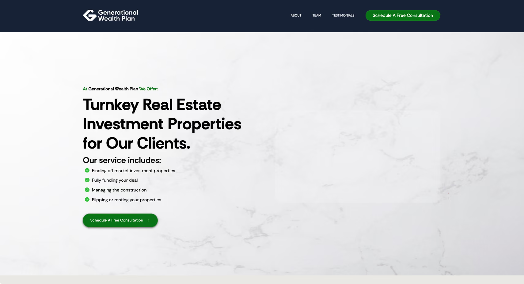
The website was answering that question badly. The design did not carry the weight of a firm that had completed 700 transactions. The content did not persuade, and the proof that existed in abundance inside the business was almost entirely absent from the page. For a prospect already predisposed to caution about an unfamiliar asset class, the site was confirming the suspicion rather than dissolving it.
It was undermining the sales team as well as the search traffic. The problem was not confined to strangers arriving from Google. When the sales team sent a prospect the link after a promising conversation, the site had to hold the credibility that conversation had built. It was not doing so, which meant the firm was losing momentum precisely at the point where a prospect goes away to make up their mind.
The brief they gave us was direct. Build something that appeals to their actual audience, and that does not look like a template somebody assembled in an afternoon.
Before the rebuild:
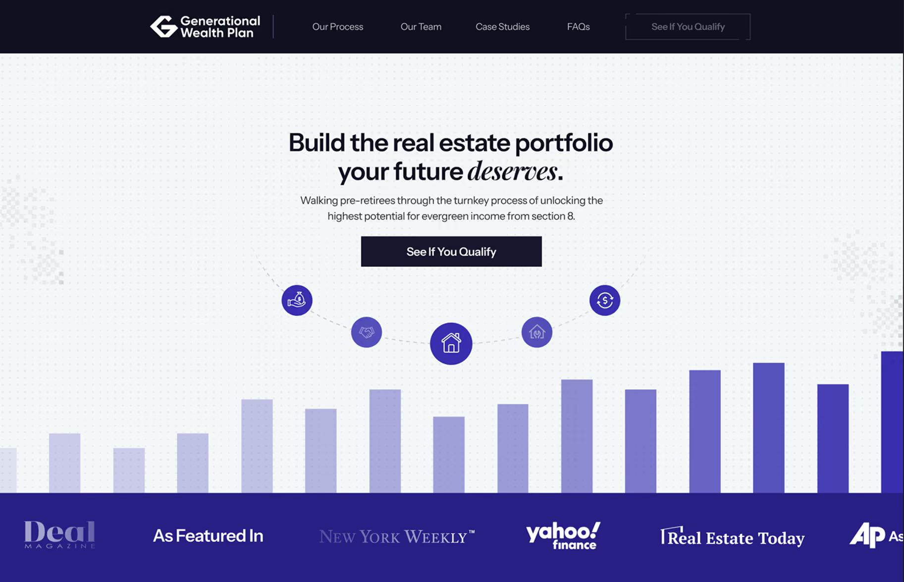
After the rebuild:
What we did
We run every engagement through the same eight stages, each of which exists because the stage before it produces something the next one requires. On this engagement the weight sat firmly in design, copy and the collation of proof.
01. Benchmark. We scored the existing site against our twelve point framework and installed conversion tracking before replacing anything, which is what allows the 57% figure to be a measurement rather than an estimate.
02. Positioning. We worked directly with both founders and with the sales team, which was the most valuable input of the entire engagement. The people having the conversations every day know precisely which objections come up, in what order, and which reassurances actually land. That gave us the real hesitations of a real audience rather than an assumed profile, and it told us which design register their demographic responds to.
03. Copy. Every section was rewritten to answer the scepticism directly rather than talk around it. Where the previous site described the opportunity, the new one explains the mechanism, names the risks and shows the evidence, on the principle that a cautious buyer is reassured by specificity and unsettled by enthusiasm.
04. Design. This carried more weight here than on any engagement we have run. The brief was to look modern without looking fashionable, and to feel professional without feeling corporate.
The audience is middle aged and older, which changes the rules. Type has to be large enough to read comfortably. Contrast has to be genuine rather than tasteful. Layouts have to be simple and linear, because a fifty-eight year old evaluating an unfamiliar investment is not going to hunt for information across a clever grid. Every visual decision was made to increase the likelihood that the page actually gets read.
The other requirement was longevity. The firm did not want to be back in two years because the design had dated. We built toward something that will still look considered in a decade, which in practice means restraint, and avoiding the specific visual language that marks a website as belonging to a particular year.
05. Development. Built responsively and phone first, to Google’s Core Web Vitals thresholds, with the migration handled so that no existing URL broke and no ranking was lost. We developed the site using Webflow, since this is the platform GWP was already using.
06. Compliance aware build. Claims about returns, risk and outcomes were structured carefully, which matters more than usual when the audience is retail investors deploying retirement capital into an unfamiliar asset.
07. AI visibility and content. The firm’s facts were written and marked up so that search engines and AI assistants can read and quote them accurately, supported by content built around what a prospect actually searches before they enquire.
08. Split testing. Once live, one change at a time, measured against the baseline captured in stage one.
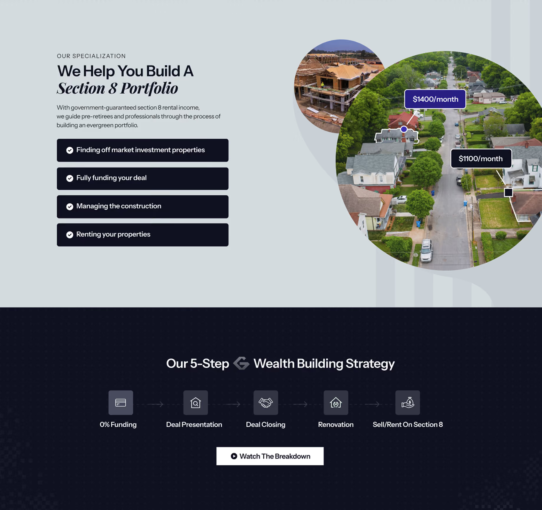
Building the evidence layer
Case studies are the part of a website most firms intend to do properly and never quite get to. Generational Wealth Plan had the raw material for dozens of them, in the form of real properties bought, renovated, tenanted and now producing income for identifiable people. What they did not have was any of it in a form a prospect could examine.
Assembling that took longer than any other part of the build, and it was largely a question of deciding what a sceptical reader would actually accept. A photograph of a finished property proves very little on its own, because anybody can photograph a house. What resolves doubt is the sequence: what the property cost, what the renovation involved, what it now returns, and how long the whole thing took. Presented that way, an individual deal stops being a marketing claim and becomes something closer to a worked example that a reader can check against their own expectations.
The same logic governed how the numbers were handled elsewhere on the site. Round, impressive figures invite suspicion from a cautious reader in a way that specific ones do not, so we used the precise counts the firm could stand behind and attached each of them to something concrete. Seven hundred transactions means little in isolation. Seven hundred transactions across a stated period, alongside worked examples a reader can inspect, is a different proposition entirely.
We also gave the sales team something they had not previously had, which was a page they could send mid-conversation. A prospect who has just been told the model works and then goes to look at the evidence for themselves is at the most decisive moment in the process, and until this point the site had been losing the firm ground at precisely that moment rather than gaining it.
The result
Within four months the firm had secured over $250,000 in fees, using the website to strengthen trust with prospective clients in the pipeline. The business has continued to expand through the same period, adding more than ten people to the team.
The numbers
- Conversion rate to qualified discussions: 1.85% to 2.9%, an increase of 57%
- Organic traffic from Google: 448 to 555 per month, an increase of 24%
- Fees secured from new clients: over $250,000 within four months
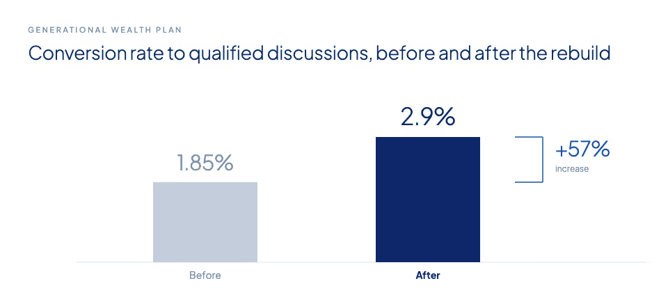
Conversion rate to qualified discussions, before and after the rebuild (qualification measured via investable assets/pre-consultation survey responses)
In their own words
“The website is amazing, it looks so much more trustworthy. It’s a great asset for us to utilize, especially right now…”
Matisse Fitzpatrick, Founder, Generational Wealth Plan
Quoted from a Zoom check-in call.
Lessons for other firms
A website is used inside the pipeline, not only at the top of it. Most firms judge their site by whether strangers arrive and enquire, which understates its job considerably. It is also the thing a prospect looks at after a good phone call, the thing a referrer checks before passing a name along, and the thing an interested party shows their spouse before committing capital. Those visitors are further down the process and worth far more, and they are the ones a weak site loses most expensively.
Design carries a different weight with an older buyer. A prospect in their late fifties evaluating an unfamiliar investment is not reading quickly and is not inclined to work at it. Type size, contrast, and a layout that runs in a straight line are not aesthetic preferences at that point. They determine whether the page is read at all, and an audience that skims a page has no basis on which to trust anything on it.
Specific evidence resolves doubt that broad claims cannot. A cautious buyer discounts round numbers and confident language almost automatically. What survives that discounting is detail: a named property, a stated cost, an actual return, a period of time. The firms that convert well are usually not the ones making the largest claims but the ones making the most checkable ones.
Build for a decade, not for a launch. The brief here was a site the firm would still be comfortable with in twenty years, which ruled out a good deal of what is currently fashionable. That is a harder brief and a slower one, but a design that dates in three years means paying twice, and it means a period in the middle where the site is quietly working against the firm again.
McIntosh & Co builds the highest level websites for advisory and investment firms, increasing their standing as the considered choice amongst ideal-fit HNW and UHNW prospective clients.
Work with us on your website:

Web design to match your prospective clients' expectations
Schedule a Consultation directly with our Head Designer to learn about our process and get an audit on your current site.